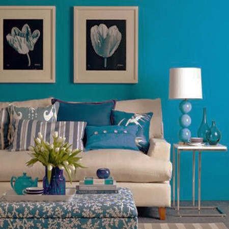
pan tone view home 2014 , style substance and color , major trends and directions , it divides in to sections
first techno color gives how to impact the world of design which gives us executed frequency in reflective s surfaces also shades role its play.
second physicality speaks to the colors of power and energy balanced by the presence of calmness some of its colors are going against the healing shades all of colors presents challenging.
third sculpted simplicity recognize shape form and structure and they don't take a center stage they are elegantly harmonized
fourth fluidity gives us watery channels and this Platte understand the human needs.
fifth collage is a gathering place for objects that are charming of artfully designs
sixth intimacy has a certain relation ship that expressing the tones of nature and the warm of colors can offer understanding color collection
seventh moda speaks of attention of details and the drama of high fashion and how it translated into interiors which has a combination can be theatrical in nature and fashionable and flourishes but always done with tasteful finesse and at the end it gives us a moment to add a glimmering final to any of all combinations.
eighth tribal threads it is the colors in the Platte are artistic appreciation related with personal expressions.
ninth eccentricity colors which brings with it a sense of adventure and discovery and its called a tongue in cheek
we will give you the top 10 pan-tone colors for 2014 :
dazzling blue: its much more of a motivator from a sales paint of view
violet tulip: its romantic colors which related to lavenders water which give re-freshness
celosia orange: its called colors of fruit it gives us joy and happiness
fressia: gives the impression of form and warmness and it gives you positive that make you feel inspiring
Cayenne: Cayenne is widely recognized as a high pitch and high energy colors in eismans eyes and its color can be a safe choice for accessories as a good choice that can make naturals like sand
plocid blue: its a colorlessness well as aback ground its a color that we look forward to seeing when we wake-up in the morning and give u optimisms colors for a good day
paloma: it gives us a quietness neutral confidence and it has a safe softness despite being architectural
sand: adds a certain colors of warmth especially inspiring in summer and spring and its look like the base of sunflower
hemlock: its women color and its has anew directions of mood
this is the top 10 of colors of 2014 we will give you brief explanation for every colors and how we work it out with decoration from every single point


0 comments:
Post a Comment